Some of the most successful direct marketing campaigns have been crazy, innovative and sometimes even ground-breaking. Today, we’re looking at what made these campaigns so successful and the thought processes behind them.
While there’s no magic formula to a successful campaign, every campaign strives for that one goal, to be unique and memorable.
So, we’ve handpicked 10 of the most successful and well-known direct mail campaigns to see what they did to become so successful!
10. Air Force FM
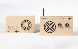
For those who can build things without instructions, George Patterson Y&R Melbourne designed an Air Force radio station that played Defence Force Recruiting’s radio ad on loop.
However, the fun part was that before you could listen to the radio, you had to build it – with no instructions!
Reason for Success:
This campaign encouraged its users to utilise a host of problem-solving skills, including wiring, soldering and assembling the radio. Once the successful candidates had built the radio, they were offered a fast track to an exciting career.
9. WVRST Sausage Party Invitation 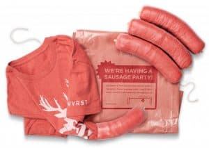
Notoriously dubbed ‘the sausage party’, WVRST’s grand opening saw it deliver t-shirts packed like sausages and wrapped in butcher paper. The campaign invited food critics, bloggers and several others to experience their grand opening.
Reason for Success:
The design of the t-shirts poked fun at animals, namely by incorporating the same artwork as their posters which saw cute animals being put through a meat grinder. Definitely not one for the faint of heart but it sure grabbed people’s attention!
8. Kit Kat Chunky 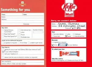
Big, red, bold, eye-catching and chunky. Kit Kat’s simple but genius design took the form of a ‘missed mail’ flyer.
In 2012, was ‘too chunky for your letterbox’. The flyer simply told people to go and collect their ‘missed Kit Kat bar’ at their nearest shop. Simple, right?
Reason for Success:
Mimicking the design of the Royal Mail’s ‘sorry we missed you’ delivery note, it was a stroke of genius. Everyone recognised it and even if they didn’t actually order anything, they were going to find out why it came through their mailbox.
Also, the free chocolate? Always a bonus.
7. Canva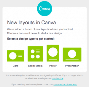
Another example of a simple yet effective marketing campaign. Canva’s email marketing campaign encouraged customer engagement by presenting four simple steps to start a new project. The design was intentionally made to look minimal and eye-catching.
Reason for Success:
Shapes are instantly recognisable and easy to mentally digest. Pair that with an assertive tagline such as ‘select a design to get started’ and it assumes the customer has already made the decision to follow through.
6. Grammarly
As many are probably aware, Grammarly was a service that performed a high impression, brand awareness campaign in 2016.
However, despite their persistent advertisements, they did incorporate an impressive marketing tactic by using tweets to promote and highlight how good their service was.
Reason for Success:
People like being mentioned by big companies, so not only did Grammarly’s persistent adverts encourage others to tweet about Grammarly, but more discussion meant increased reach and growth for the company.
5. World Water Day 
Another success story for 2009 was Green Belgium’s World Water Day Campaign. This direct mail campaign became popular for two main reasons; the first was how it involved charity in a mail marketing campaign, the second was its innovative design.
Reason for Success:
Another simple but ingenious tactic of marketing – tapping into human curiosity. The message told people to run the flyer under a tap. Surely it would fold and break, right? Well, that question was enough to get thousands of people to test it for themselves.
Once they had run the flyer underwater, the message was revealed. Regardless of whether people ‘bought into’ the idea or read it and to a degree, this is what made the campaign a success.
4. The Smart Bike Helmet
The mail helmet was designed and sent out by Smart to promote its new range of e-bikes to, you guessed it, cycling enthusiasts.
The helmet was made from recyclable cardboard – making it both environmentally friendly and easy to assemble. It came flat packed with easy-to-follow instructions for those willing to give it a go.
Reason for Success:
The design element followed a similar principle to the GGRP mini record player, in that it served a purpose. These designs were not just leaflets with text on them, they actually offered innovative, physical enjoyment. Even if people did not use the helmet, it acted as a fun novelty item. Sitting in your living room building the helmet meant that you were consciously thinking about the product – meaning the campaign had achieved its job.
3. The Theatre Academy
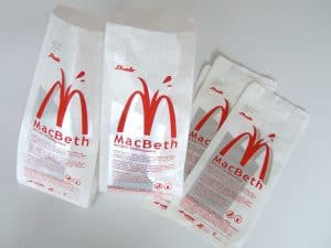
To promote their production of Macbeth, Theatre Academy in Bratislava used paper bags to promote their production. The bags acted as invitations to the production, but the marketing stunt lied within the bag’s design.
Reason for Success:
Using a logo that is strikingly similar to the McDonald’s world-renowned ‘M‘ was a stroke of genius. The fact they used bags also gave the public a reason to carry the advertisement around with them. A popular logo slapped on a theatre production is bound to turn heads.
2. Mis-fortune Cookies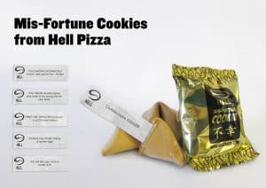
Hell Pizza took the concept of fortune cookies and turned it on its head. Instead of giving insightful and optimistic fortunes, Hell Pizza instead chose to fill their cookies with darker messages. This comedic approach was definitely an eye-catcher and a risk that ultimately paid off!
Reason for Success:
Again, human curiosity takes the crown here. Even if you don’t believe in fortunes, there’s always an element of fun to be had opening one and seeing if it somehow applies to the route your life is taking. However, what’s more fun is opening something that’s blatantly making a farce of the fortune cookie concept. It’s light-hearted and genuinely funny, who wouldn’t want to open one?
1. LavOnline: Tomato Splat
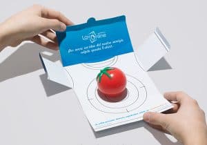 This is my personal favourite, why? Because not only does it tap into human curiosity, but you get to throw a tomato at a target. LavOnline’s direct mail campaign sought to entice people into testing out how effective their stain removal was. The campaign encouraged people to throw a tomato at the target and then watch as the target reforms while simulating the removal of the stain.
Reason for Success:
It seems as though there’s a pattern emerging between successful direct mail campaigns and human curiosity. Being asked to throw a tomato at a target to prove whether a laundry service is worthy of money is a fun and engaging way to discover whether a product truly says what it does on the tin.
All of the above-mentioned direct mailing campaigns were successful in their own independent ways. What all of the campaigns have in common is that they harboured a personal element attractive to potential buyers.
Curiosity seemed to be a successful theme as simple challenges like building a bike helmet and throwing a tomato at a target are easy and enjoyable activities that are far better than filling out a questionnaire.


